The most important aspect of creating the perfect IamSnowfox. logo was that it feel and look as loveable and cute as the creatures she creates. Using only organic wool and natural materials when possible, each IamSnowfox creation receives the same painstaking hand-made attention to detail, making each creature uniquely individual. The brand reflects the same attention to detail, from lines graphics down to the materials used.
Simple, elegant lines create the circular form of the logo, with the fox’s eye forming a focus point in the center. The typography was painted by hand using ink and brush. Keeping the lines and type two different shades of grey emboldens the simplicity and form of the logo, and means it fits with most any colour background.
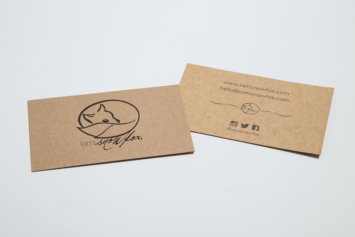
Natural recycled fibre card was chosen for the business cards and a simple motif carried the logo through from front to back without it overpowering the contact information.


